Climate Change in Australia
Climate information, projections, tools and data
Global Warming Levels
Climate projections based on global warming levels describe the expected change that will be experienced in Australia when the world reaches particular levels of global warming since the pre-industrial era.
A key application of global warming levels is in the aims of the Paris Agreement (2015) :
“…to strengthen the global response to the threat of climate change by keeping a global temperature rise this century well below 2 degrees Celsius above pre-industrial levels and to pursue efforts to limit the temperature increase even further to 1.5 degrees Celsius.”
Global warming level projections are a depiction of the climate of Australia when the global surface air temperature (GSAT) is consistently measured at a temperature ‘level’ warmer than a pre-industrial climate, with ‘levels’ most commonly used as +1.5, +2, and +3 °C, noting the global warming level benchmark is for:
- Global average temperature (including over oceans) – not local temperature at any one place
- From the 1850–1900 baseline (reference period) – not from today
Also, note:
- The Global Warming Levels relate to policy benchmarks, and while greater warming roughly relates to extra climate risks, risk is on a continuum with no hard thresholds at any one warming level.
- We examine Global Warming Levels at the point if and when we reach them within the next 100 years, as this is most relevant to our immediate planning decisions. However, the aim of the Paris Agreement is about stabilising at 2 °C or less in the long-term, and work is underway to understand important changes that play out over many centuries – known as climate stabilisation – including work from Australian scientists .
- A suitable baseline before the industrial era began would be 1720–1800, but climate observations are poor across this period. The 1850-1900 period has been widely accepted as a proxy for the preindustrial climate, representing a balance between data availability and low industrial activity. This baseline is used in the Intergovernmental Panel on Climate Changes (IPCC) assessments, (for more detail see Climate Lab Book ).
Pages in this section
Temperature Change gives projections of change in average annual temperature in Australia at different global warming levels
Rainfall Change shows projections of change in average annual and average seasonal rainfall in Australia at different global warming levels
Current Warming Level gives a snapshot of where we are right now; which is currently approaching 1.5 °C global warming.
Reaching Global Warming Levels describes the projected time windows where the world will reach each of the global warming levels under different emissions pathways, noting the precise date depends on three factors: 1). the global greenhouse gas and aerosol emissions, 2). the strength of the response to greenhouse gases (known as climate sensitivity) and 3). climate variability. We will reach 1.5 °C global warming soon under all scenarios of climate change. There is an estimated window for reaching other global warming levels for each emissions pathway the world may follow.
Australian warming reports on warming in our region – noting Australia has warmed by more than the global average (land and ocean), and similar to the global land average.
Years at +1.5 °C level shows the years we have already experienced that would be consistent with an average year in a +1.5 °C world. For example, the annual temperature of Australia’s hottest years on record, 2019 and 2024, were roughly what we expect to be the average temperature in a +1.5 °C world. Some but not all states have seen years consistent with the average in a +1.5 °C world too.
Methods details the ‘time sampling’ method used in this analysis.
Comparison of the climate projections frameworks
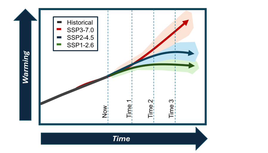
Future climate change, climate impacts, climate change adaptation and emissions mitigation can be viewed using different frameworks also called ‘dimensions of integration’. Here we compare the main two used – emissions pathways and GWLs
Emissions Pathways (also called concentrations pathways or emissions scenarios)
This framework means showing change through time or at various future time periods under different plausible future emissions pathways, derived by considering a range of socio-economic and technological scenarios. This is the most widely used and best understood method – and is the framework used for most climate projections information on the Climate Change in Australia website.

Global Warming Levels (GWLs)
This framework means showing future changes in climate within a region when the global average temperature reaches a particular level of global warming from the 1850-1900 baseline. Global Warming Level projections can be quantified for different warming levels, e.g. 1.5, 2, 3°C. This framework is becoming more widely used.

There are various advantages and disadvantages to each framework:
| Emissions pathway or scenario projections (e.g., SSP and time horizon) |
Global warming level projections |
|---|---|
| Advantages | |
|
|
| Disadvantages | |
|
|
Table adapted from CSIRO and Bureau of Meteorology (2025)
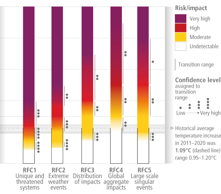
Why does the Paris Agreement use the GWL framework? Changes to Global Surface Air Temperature (GSAT) can be roughly related to the scale of climate impacts experienced, creating simple intuitive targets to use. The IPCC has in the past often communicated climate related risks in relation to rising global average temperature for five key Reasons For Concern (RFC) using the ‘burning embers’ diagram – here is a simplified version for illustration:

Source: IPCC Working Group 2 on Impacts and Adaptation (new window), see this report for more detail, and for analysis of changes and impacts at Global Warming Levels, including for different regions.
A third framework - cumulative global carbon emissions
A third framework through which we can view the future climate is the cumulative total anthropogenic carbon dioxide emissions – the total emissions humans have emitted over time since the pre-industrial baseline climate (often quantified as emissions since 1870). This starts with global warming level and then goes on to relate this global warming to cumulative CO2 emissions as the most abundant anthropogenic greenhouse gas. In the past and for the rest of this century, our total carbon emissions are directly related to Global Mean Surface Temperature increase, in an almost straight-line relationship. Therefore, regional temperature change, climate impacts, and adaptation decisions can be roughly related to cumulative global carbon emissions and the global emissions reduction that this involves. The near linear relationship between cumulative CO2 emissions and the global temperature change can be visualised in this schematic adapted from: IPCC 2021 (new window).

Why use this?
This method allows the analysis of climate change and its impacts in the context of carbon and emissions ‘budgets’ – to directly relate climate impacts to mitigation efforts and policies at a global scale. This is useful for global discussions of emissions mitigation policy and strategy.
The initial global warming projections were produced with the support of the Australian Government's National Environmental Science Program’s Earth System and Climate Change hub
Page last updated 1st December 2025


