Climate Change in Australia
Climate information, projections, tools and data
Temperature change
Note: reaching a global warming level means the global surface air temperature (GSAT) is steadily at or near that level, relative to the early baseline 1850–1900 chosen to approximate the pre-industrial era (a baseline is a reference period to measure change from). Change can also be reported from a recent period or a recent warming level to a future warming level
Global change from the pre-industrial era
Observations and climate models of historical and future change broadly agree on many features in the spatial pattern of temperature change since 1850-1900, giving us confidence the climate models are reasonably reliable. Here we show projected change for a range of GWLs derived from the latest CMIP6 set of global climate models. Specifically, from the nine-model ensemble made available as application-ready data (broad patterns of change are similar in the full CMIP6 ensemble). The central estimate projection shows:
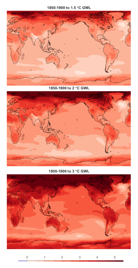
More warming over land, Arctic is a hot-spot, Southern Ocean is a minimum (consistent with what we have observed)
Note: Lower warming doesn't necessarily mean less or lower impacts of a changing climate. The impact of any warming amount is a function of the physical change, including the change in the average but also the change in extremes, and also the exposure and vulnerability of the relevant systems.
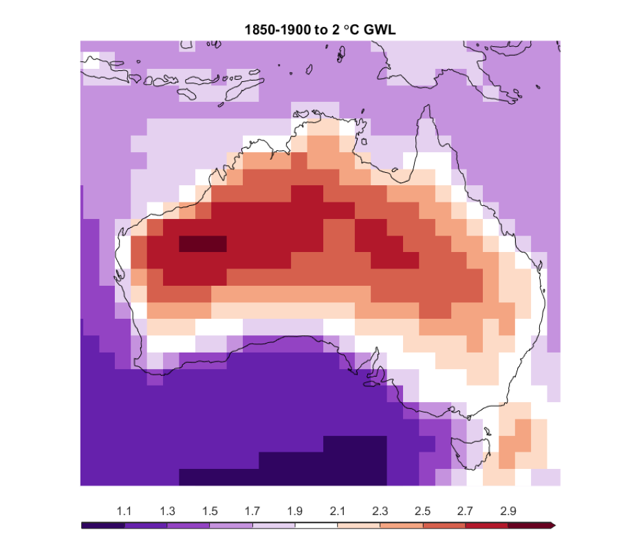
Taking a closer look at the +2 °C global warming level and plotting the change with a colour scale centred on 2 °C itself, the temperature change relative to the global average change can be seen.
Note: Purple colours indicate regions warming less than the global average, NOT cooling (except in some exceptional circumstances).
, northern hemisphere land areas generally more than global average, Oceans less than global average, Australia slightly above the global average.")
Australia
Zooming in on Australia we see a consistent spatial pattern of warming emerge with increasing magnitude as we reach higher GWLs:
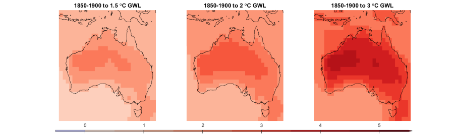
Greater warming inland than at the coast, and for the ocean, greater warming over the oceans in southeast Australia (the East Australia Current region) than other ocean areas
Putting warming on a colour scale centred on the 2 °C global average, we see more clearly that warming is greater than the global average inland, near the global average at the coast, and lower than the global average in some coastal regions and Tasmania. The only region warming by more than the global average is the southeast region (the East Australia Current). Again, purple colours show warming lower than the global average, not cooling.
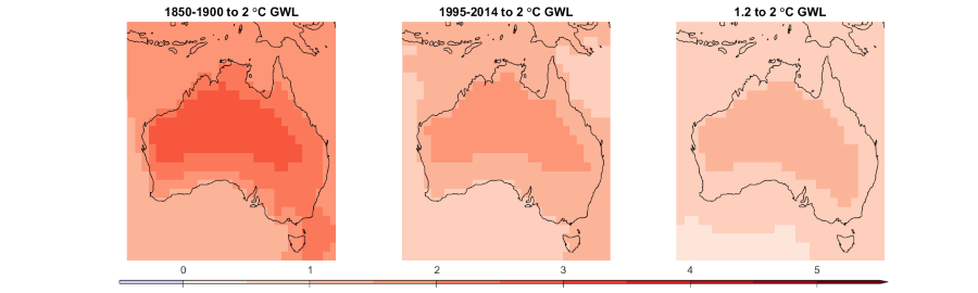
From recent baseline and recent Global Warming Level
We usually calculate global warming relative to the 1850-1900 baseline used as the preindustrial reference period, in other words the 0 °C Global warming Level. But we can report regional climate change from any period - from the same early baseline, a recent baseline, or from a recent Global Warming Level. Since we have already experienced some historical warming, the change is lower when reporting from a recent baseline or GWL than from 1850-1900.
A recent standard baseline used in IPCC Sixth Assessment Report is 1995-2014. The historical warming before the 1995-2014 baseline is reflected in the central estimate projection from each of the two baselines to the future time when the world reaches the +2 °C warming level. Similarly, a standard recent GWL used to report observed change is 1.2 °C (reflecting the climate of the early 2020s). The warming of Australia between the 1.2 °C to 2 °C Global warming Levels is also reflected as a lower change than from the pre-industrial baseline (or 0 to 2 °C GWL):
Ranges of change
The maps above show the central estimate (model average). However, there are a range of model results, which we can see in the area-average Australian temperature change shown as a bar chart. Here again we show the nine-model ensemble, results are generally similar as those from the entire CMIP6 ensemble:

Australian warming from 1850-1900 is similar to or just above the global average. Warming from a more recent baseline or GWL is lower – incorporating warming already experienced to those periods
Note: Observations to date indicate Australian warming of around 1.6 °C from 1850-1900 compared to around 1.1 °C for the global average warming. This makes a ratio of around x1.4 (see Australian Warming for more information). Extrapolating this ratio forward suggests that when the world is at 1.5 °C, Australian warming will be around 2.1 °C. Most models produce a lower ratio than this observed ratio. This requires further investigation, but the observed ratio to date is higher than most models for a few possible reasons:
- Climate variability in observations
- Observational uncertainties may mean the ratio is overestimated in observed datasets (e.g. observations over oceans and remote areas are sparse)
- Models tend to underestimate this ratio, or
- Some combination of these three
Presently we don't have sufficient evidence to reject models or to narrow the model projected range. There is not enough evidence to determine the most likely outcome, or to assign probabilities. A precautionary approach is to use the value from historical warming ratio in observations that is at the high end of model estimates (i.e. assume that Australia will be around +2.1 °C when the world is at +1.5 °C).
Page last updated 1st Dec 2025